5 steps to speed up your image heavy website
Another factor that comes into picture with mobile devices is the Device Pixel Ratio or the DPR value. Modern mobile phones have high density screens that pack more pixels in the same square inch.
An image that look fine on regular devices, would look slightly blurred on a high density screen. A solution to this is to load a 2x size image on screens with DPR 2, a 3x image on screens with DPR 3 and the normal image 1x size image on other devices. This too can be accomplished using the responsive image tag as shown below.
A modern specification called Client Hints, makes it simple to get started with responsive images and makes the code look much cleaner as compared to the `srcset` and `sizes` attribute method. How client hints work is a huge topic in itself that it is out of scope for this post and has been covered in detail here.
ImageKit provides you with a URL-based DPR parameters along with resize and crop parameters, and also supports client hints, that makes it very easy to use responsive images and deliver perfect images across devices.
4. Load fewer resources
Even after you have optimized all of your images, loading too many of them is bound to slow down your website and negatively impact the user experience. I am not advocating that we should use lesser images. But, there are cases where we can avoid using images or avoid loading them up front.
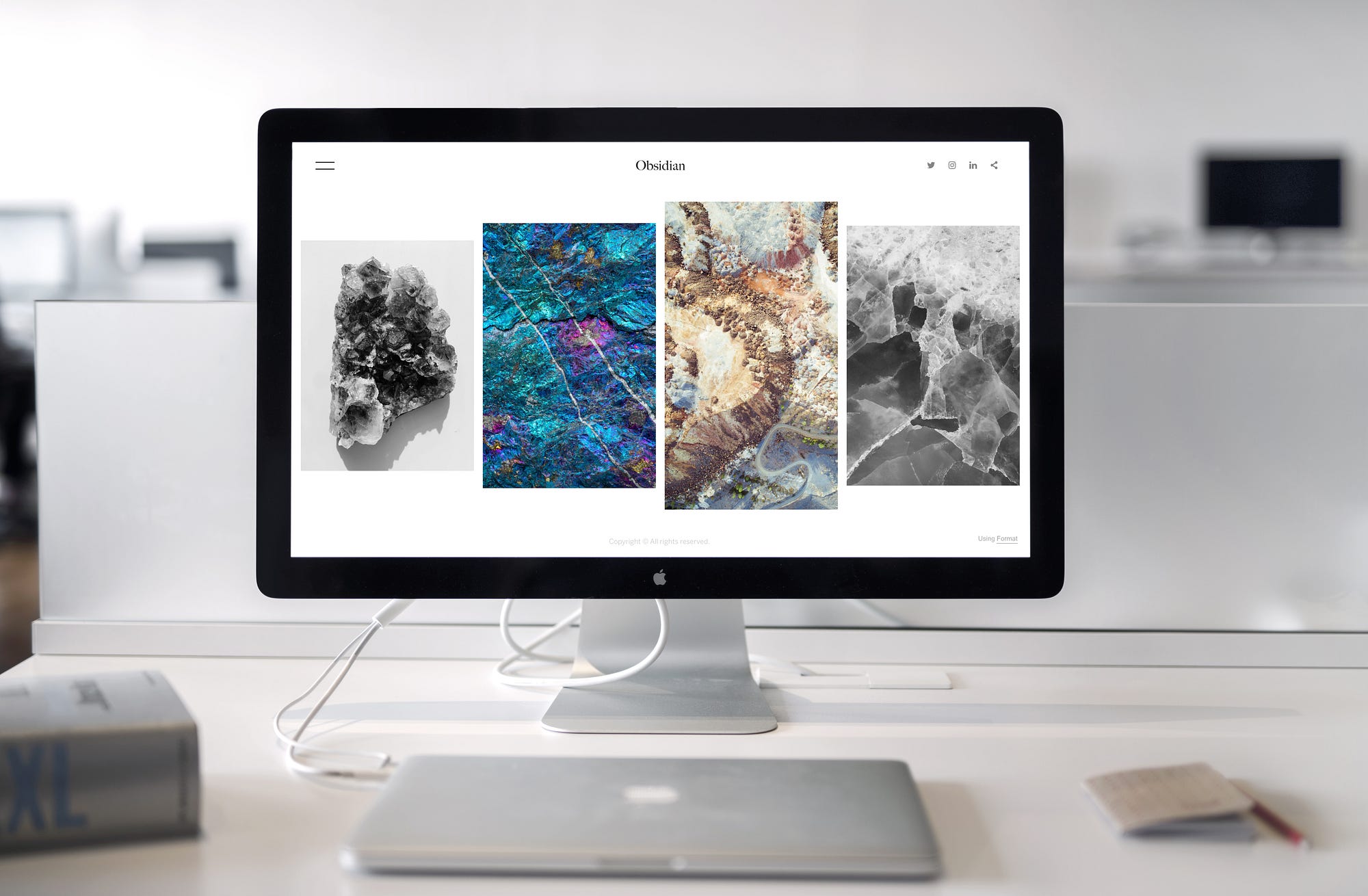
For example, instead of loading images, you can create buttons, gradients and other advanced elements using CSS.
The other more important technique that you can use is lazy loading for your images. Lazy loading basically means that we defer loading of images that are not required immediately. Typically, any image that is not visible to the user on his screen or the viewport, can be loaded at a later point in time i.e. when the image enters or is about to enter the viewport.
[“source=insivia”]
About Author