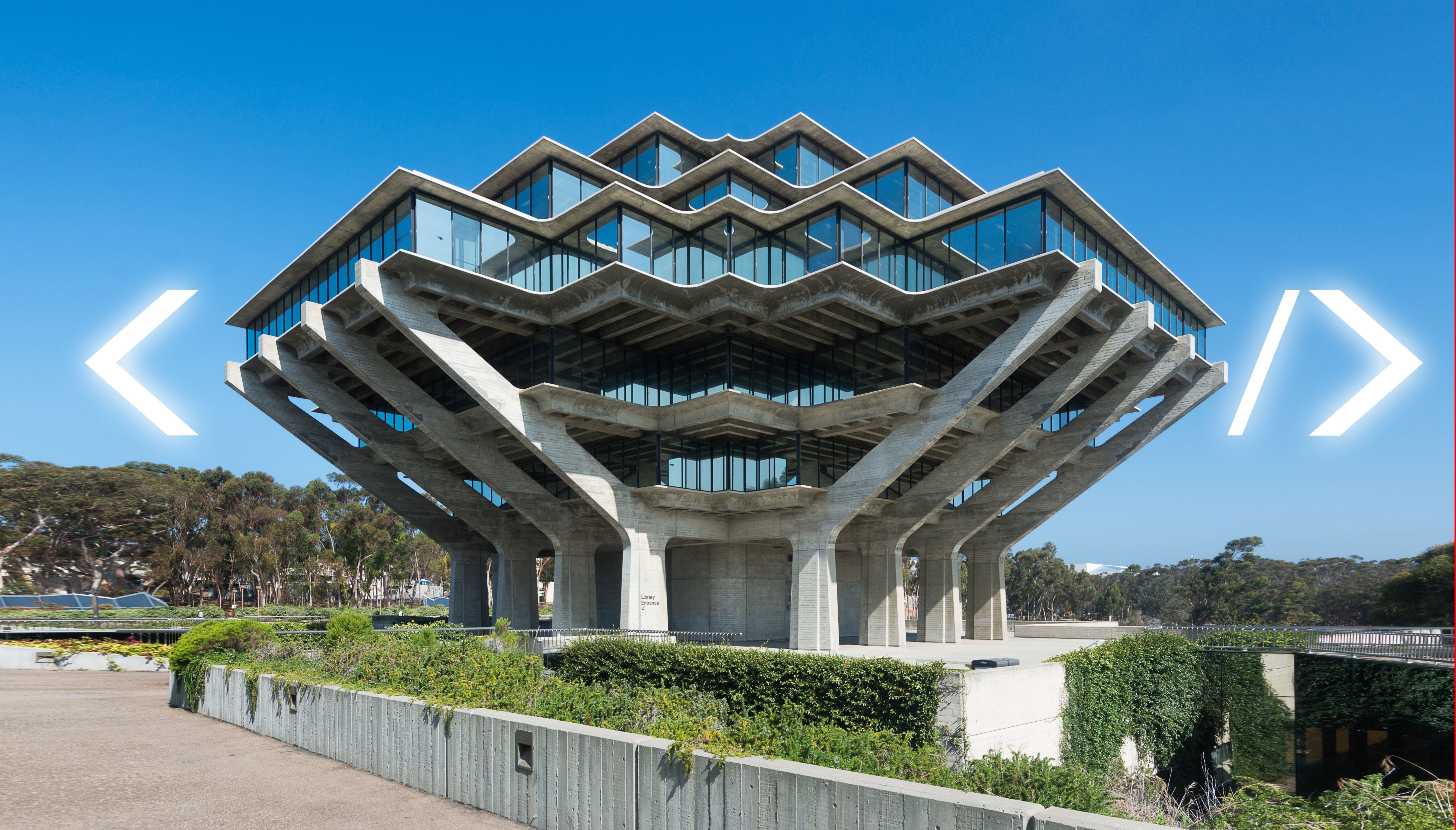
Guidelines for brutalist web design

“Raw content true to its construction” — no hinky web frameworks, no broken javascript soiling itself at the first whiff of interaction the developer didn’t design for, no dark patterns, no performance-crushing superficial cleverness, no contempt for the user: guidelines for brutalist web design.
Brutalist Web Design is honest about what a website is and what it isn’t. A website is not a magazine, though it might have magazine-like articles. A website is not an application, although you might use it to purchase products or interact with other people. A website is not a database, although it might be driven by one.
A website is about giving visitors content to enjoy and ways to interact with you.
The design guidelines outlined above—and detailed below—all are in the service of making websites more of what they are and less of what they aren’t. These aren’t restrictive rules to produce boring, minimalist websites. Rather these are a set of priorities that put the visitor to your site—the entire reason your website exists—front and center in all things.
Yes, you are allowed to use link colors other than blue. But don’t get too fancy, buddy.
Source:-boingboing.