This week, Google announced a new set of tools called Material Themingthat helps developers implement the Material theme across apps, including mobile and web. App-makers can choose from a variety of components and design transitions and Google even uses AI to make everything look coherent. Like the WYSIWYG HTML editors of yore, Material Theming makes it easier for developers to design apps their way while sticking to Google’s design paradigm.
How Google’s ‘Material Theming’ will change your Android experience

Previously, if you visited Google Docs on the web and then hopped into a third-party Android app, you’d often experience a bit of a deja vu with regards to the interface. But Material Theming isn’t an entirely new theme; it’s just an improved way for developers to stick to consistent design parameters while allowing their own aesthetic to shine through.
Made for developers
At Google I/O 2018, the search giant explained why it created Material Theming. The guidelines that the company originally wrote for Material Design encouraged developers to make apps that looked too much alike. Indie apps, for example, became difficult to distinguish from Google apps laid out in the same design scheme, even if they employed different color palettes. Developers were having difficulty branching out from the guidelines and developing a “brand” of sorts, in turn contributing to a cycle of Android apps looking too much alike.
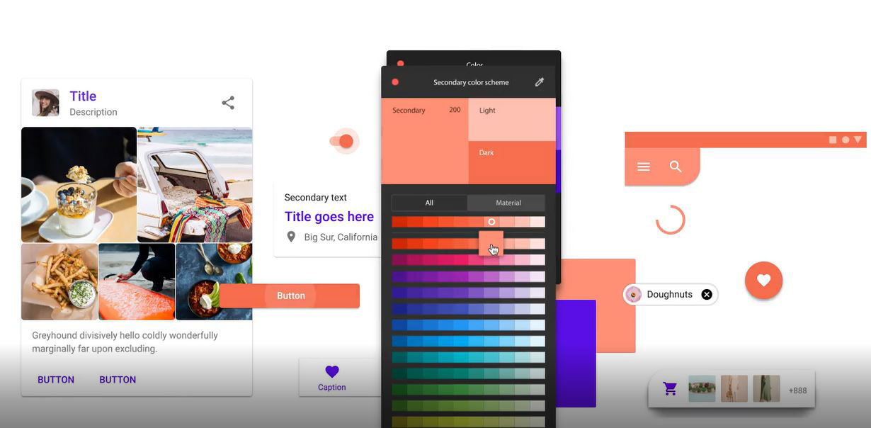
Material Theming is the cure to the monotony. Once it’s plugged into Sketch — a prototyping app — developers have access to a variety of customization tools. Elements like button-type and sizing are determined by the developer. They have even more options for button size and shape, too, rather than the floating circle that usually suggests an action in an Android app. (That circle is called a FAB, or Floating Action Button — these buttons are called Extended FABs.)
There’s a layout grid that developers can take advantage of, to help maintain the look and feel of the app interface on every platform. So when you go to view that app on your iPad, or on the web, it looks and acts the same as on Android. You don’t have to change your usage patterns just because you’re on a different device.
The Material Theming plugin also offers machine learning smarts that make it easier for developers to build better-looking apps. Whenever the developer makes a change to the layout, the algorithm determines whether the overall design looks coherent. Android apps will now have no excuse for bad design, even if the person who coded it had no artistic proclivities. For developers, this algorithm is like having a sibling or a best friend with an eye for style always on hand. Except, in this case, it’s Google guiding developers towards how things should look.
Text is also a major part of Material Theming. By default, the tool comes loaded with Google’s Roboto font. But if a developer doesn’t want to stick with that, they can then upload their own font and scale at will. This lets them have more control over the app’s look and feel, beyond just the color schemes and button-types. Fonts can really set the mood for an app. After all, it doesn’t look like a very engaging app for kids if all the fonts look like the boring folder labels on a desktop computer.
There are more customizable interface elements coming down the line, as confirmed by Fast Co Design. Google plans to update the Material Theming tool on a monthly basis and may introduce the ability to edit things like drop shadows, strokes, and animations. There’s even talk of bringing realistic textures to the interface, which could shake up Android’s flat design. Nothing is for certain yet, but when it happens, it’ll be available to developers first in Material Theming.
Refinement, not a revolution
The Material Theming announcements aren’t just limited to it being an accessible tool for developers. It introduces better design schemes, so apps are prettier and easier to navigate. Material Theming isn’t a far departure from Material Design; it’s just a spruced up version, with better buttons, cleaner layouts, and improved organization.
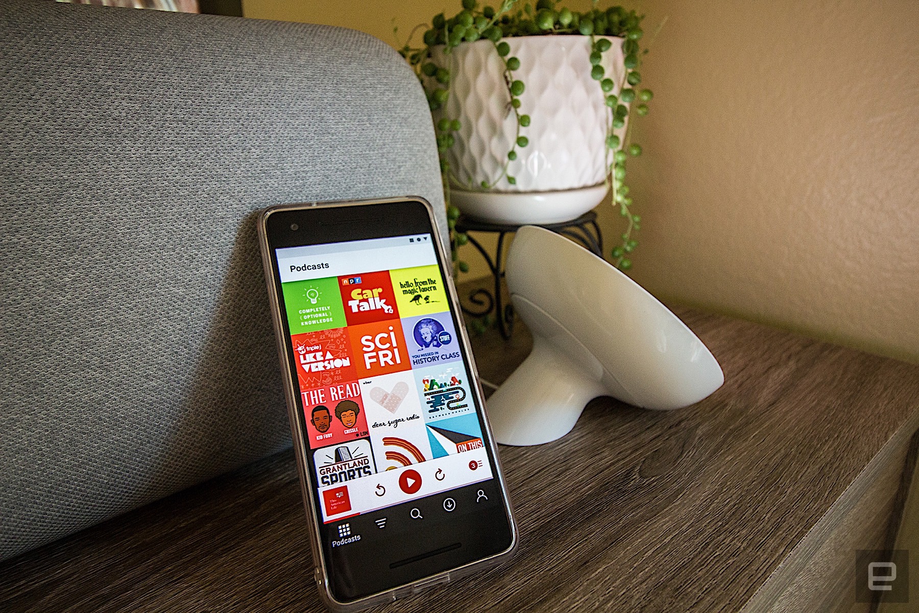
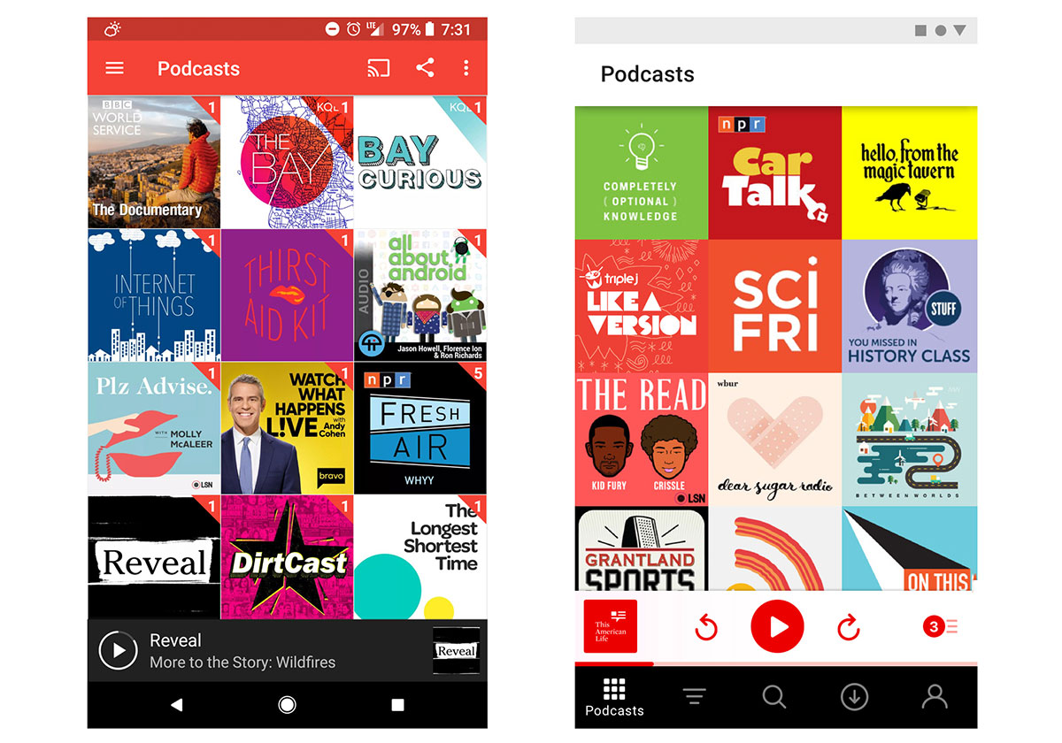
I spoke with Pocketcasts’ Chief Product Officer, Russell Ivanovic, about Material Theming and what it means for the app’s future. (Full disclosure: we also record a podcast together.) Pocketcasts is featured on the Material Design blog as a case study, complete with mockups of what the popular podcasting app could look like under the new Material Theming guidelines. “The prototype feels and works better than the current version. It looks like a major overhaul when viewed with no context and no motion,” he wrote. “In practice, though, it feels like a refinement, not a revolution.”

The prototype shows a softer-looking Pocketcasts app, with a white interface instead of its current red one. In fact, the only color is found on interactive components — buttons and progress indicators — which attract eyes directly to where the action is happening. The navigation elements are also placed front and center towards the bottom of the interface, rather than hidden in the hamburger menu. Their sample uses new transitions, too, though they’re not visible in the image on the blog. Essentially, when the app goes to the player screen, parts of the app, like the bottom navigation bar, transition in continuity with the playback controls. Google describes it as clean transition out of sight.
“Material Design brought an amazing design system that Android was sorely lacking,” added Ivanovic, before noting that following the guidelines often made apps hard to differentiate. When I asked if it was because they were too confining, he replied, “It’s maybe that Google didn’t make it clear that these were guidelines to build on top of and branch out from — they’ve made that clear with Material Theming.”
More to come

Material Theming is more than just a tool to guide developers. At its crux, it’s a constantly-evolving design paradigm, though we don’t really know what’s next from Google. There are a few hints as to the different interface elements that might change down the line. And whenever they come through, developers will be able to implement them without disturbing your app experience. You might even start to see more apps across platforms designed in the “Google way.”
If you’re curious about experiencing the new Material design and what an app might look like after going through Material Theming, there are already a few apps sporting the new paradigm. On the web, you can see it with your inbox at Gmail, and on Android and iOS, Google Tasks is a great way to become acquainted with the experience.
source:-engadget