Move over, Google: Microsoft’s the new Android trailblazer

Every year ’round this time, we start thinking about what Google’s got in store for Android in the months ahead. And broad trends aside, the biggest questions tend to revolve around the year’s upcoming Android release.
Some Android versions are mostly about under-the-hood improvements, while others focus on bits of subtle but significant polish. And sometimes, we see massive foundational changes to what the operating system represents — the switch to on-screen navigation buttons in 2011’s Honeycomb and Ice Cream Sandwich; the introduction of the modern, card-centric Material Design interface in 2014’s Lollipop; and then the advent of gesture-driven navigation in 2018’s Pie (and, uh, again in last year’s Android 10 update).
It’s still too soon to know for sure what themes we’ll see come up with this year’s Android 11 offering, but I have a sneaking suspicion the most interesting and potentially transformative advancements for Android this year won’t actually be connected to that software at all — or to any of Google’s own efforts, for that matter.
Stay with me here, ’cause I swear I haven’t lost my mind: The most consequential changes to the way we use and think about Android in 2020 might come from…Microsoft.
Yes, Microsoft. What a weird, upside-down world we live in, I know. But when you stop and think about it, it actually makes an awful lot of sense.
After failing to serve the Android faithful for ages — first ignoring the platform entirely and then wildly misunderstanding its nature for a while — Microsoft started getting serious about our virtual stomping ground a few years back. It made almost shockingly good versions of its office apps for Android, created its own Android launcher to turn Microsoft into a focal point of the phone-using experience, and then little by little built out an entire Microsoft sub-platform that existed within Google’s virtual walls.
The company essentially created a Windows Phone 2.0, in other words, only this time doing it in a way that piggybacked off the world’s most widely used operating system instead of trying to go up against it. Just like Google, amusingly enough, Microsoft is now taking a post-OS era approach and focusing on ecosystem over operating system.
So when we heard last year that Microsoft was building its first self-made Android device, the dual-screened Microsoft Surface Duo, it was clear this wasn’t gonna be Yet Another Unremarkable Android Phone. Microsoft was up to something grander here — something intriguingly unusual and decidedly different.
To be sure, there’s still plenty we don’t know about the Duo and ample cause for skepticism. But with the release of a Duo-specific software development kit and loads of associated documentation this month, we’re getting some fresh clues about Microsoft’s true ambitions for the device — and its ultimate plan for pushing Android into some wild new territory Google itself has yet to explore. And if you ask me, this has the potential to be one of the most significant advancements Android’s seen in a good long while — the sort of thing that could have huge implications not only for the future of the platform but also for mobile technology in general.
Specifically, there are two main reasons I’m cautiously optimistic about what Microsoft’s about to do with Android — my two key takeaways from the company’s mountains of Duo-related materials.
First:
While lots of companies are coming out with foldables, Microsoft is coming out with a smarter twist on the concept — and coming up with a genuine reason for it to exist.
When we talk about foldable phones right now, two common themes come up: First, by and large, they’re innovation for the sake of innovation — a solution in search of a problem that doesn’t quite exist. Cool as they may seem, they just don’t add much of meaningful value into the day-to-day phone-using experience. And even in the rare situations where they may have some practical benefit in terms of portability, they’re laden with compromises that make them inadvisable for practically everyone.
Instead of following mindlessly onto that foldable bandwagon, as most manufacturers seem eager to do these days, Microsoft came up with a smarter setup: a phone that folds in half, with two separate screens that sit side by side. And sure, there’s a thin hinge between ’em — but when you see how the Duo’s designed to work, you realize that doesn’t really matter all that much. (And also, call me crazy, but that thin hinge seems way less distracting than the clunky seam on the screen of a foldable phone and the host of durability issues that come with it.)
The most interesting advantage the Duo provides, y’see, isn’t being able to treat its dual displays as a single large screen (though you certainly can do that, in certain scenarios). It’s being able to treat them as separate but complementary parts of a phone-using experience — something that really seems like it could change the very nature of how we think about Android and mobile computing.
To wit: Microsoft’s software development kit details five core ways apps can tap into the Duo’s dual screens and take advantage of their potential. There’s technically a sixth — the basic “extended canvas,” where an app stretches across the two displays — but it’s the more advanced patterns that show off how Microsoft’s managing to evolve Android in a way that Google has not.
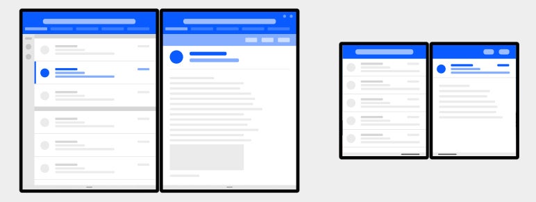
Take, for instance, the “master-detail” arrangement. There, apps split their content between a master pane, which contains some sort of list-like view, and a details pane, where extra information resides. Think of it like Outlook’s preview pane, transformed into a standard operating system element — and think of all the ways apps ranging from email clients to calendars, photo galleries, and even music players could take advantage of it.
 Microsoft
Then there’s the “two page” view, in which apps can provide an open-book-like experience, complete with page turning. It’d evolve the way we experience reading-related apps, for sure, and it could also create some interesting possibilities for document- or note-oriented scenarios.
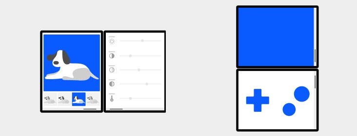
The “dual view” setup lets an app show similar sorts of content side by side — two documents, two lists, two images, or even two products on shopping sites — so you can easily compare and work across the two items without having to do any cramped screen splits or awkward back-and-forth switching.
 Microsoft
And finally, the “companion pane” view is designed to show complementary interface elements — tools, menus, or control panels that’d typically be hidden behind a button in a standard single-screen environment — right alongside your main work area.
 Microsoft
Beyond those possibilities, there’s also the plain and simple option of having two different apps exist on their own screens, side by side. And in that arrangement, if the apps support it, you can drag and drop content between the two programs — text, links, images, or even “rich objects” — instead of cutting and pasting.
See what’s happening here? Microsoft actually took a thoughtful approach to how an extended-screen setup should work and precisely what sort of real-world, instantly relatable value it should provide. Instead of taking a cool-looking new kind of technology and then trying to find a reason for it to exist, Microsoft came up with the reason — and then came up with the device to support it. With all the wild phone forms flying around right now, that’s something no other company has yet managed to do.
There’s another side to this story, though — one that’s critical to a phone like the Duo, or any other device with an unusual approach, to succeed. And based on this early look at Microsoft’s strategy, it sure looks like the company is setting itself up to nail it.
Microsoft is building in a smart fail-safe and making sure that apps without specific dual-screen support will still work well in its setup.
Regardless of how intriguing the Duo’s advanced use-cases are, this part is key. I mean, think about it: The Achilles’ heel of Microsoft’s entire strategy here is the fact that it requires Android app developers to actively optimize their apps in order for them to function in any of those aforementioned arrangements. You aren’t just gonna open up the Duo, pop open any ol’ app, and have it be magically ready to handle those sorts of next-level screen-spanning arrangements. And we all know how poky some Android developers can be at adopting new standards.
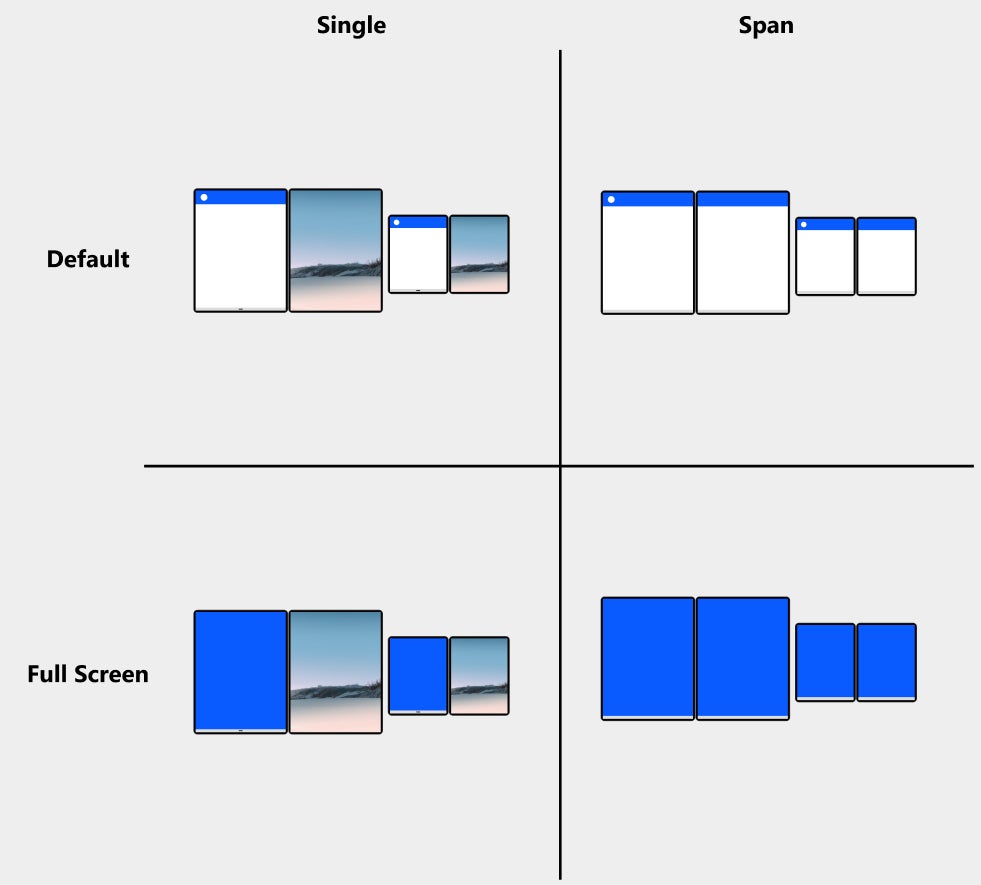
But here’s the saving grace: According to Microsoft’s development documentation, Android apps on the Duo will always default to opening on a single one of the device’s displays — thereby looking and acting just like they would on any regular Android device.
 Microsoft
There is no compatibility question, in other words, because the default setup is exactly the same as what you’d get on any other Android phone. So at the worst, you have a device that lets you focus on one app on a standalone 5.6″ screen while then having the ability to pull up any other app or process on a second 5.6″ screen. That could still be interesting, particularly if the hardware is compelling. And at the best, well, you’d have apps that can do all those other advanced possibilities we were just mulling over.
Now, let’s not get ahead of ourselves: This is still just a concept. There are still tons of unanswered questions about the Duo, including its cost, the limitations surrounding its single-camera (only on the inside!) setup, and how exactly Microsoft will handle software updates.
But based on the concept, at least, it sure looks like this device has all the practical productivity benefits foldable phones are lacking — and without all the hardware-driven drawbacks those devices possess. With Android 10, Google created the basic framework for how apps could exist across multiple panels. Microsoft, meanwhile, seems to be the one taking that ball and running with it — coming up with a clever new concept and one-upping Google on its own terrain.
This is the sort of stuff that makes you sit up and say: “Oh! Right. Now I see why this could be useful instead of just novel” — and maybe, just maybe, the sort of stuff that ushers in a new era for the types of experiences Android can enable.
[“source=computerworld”]